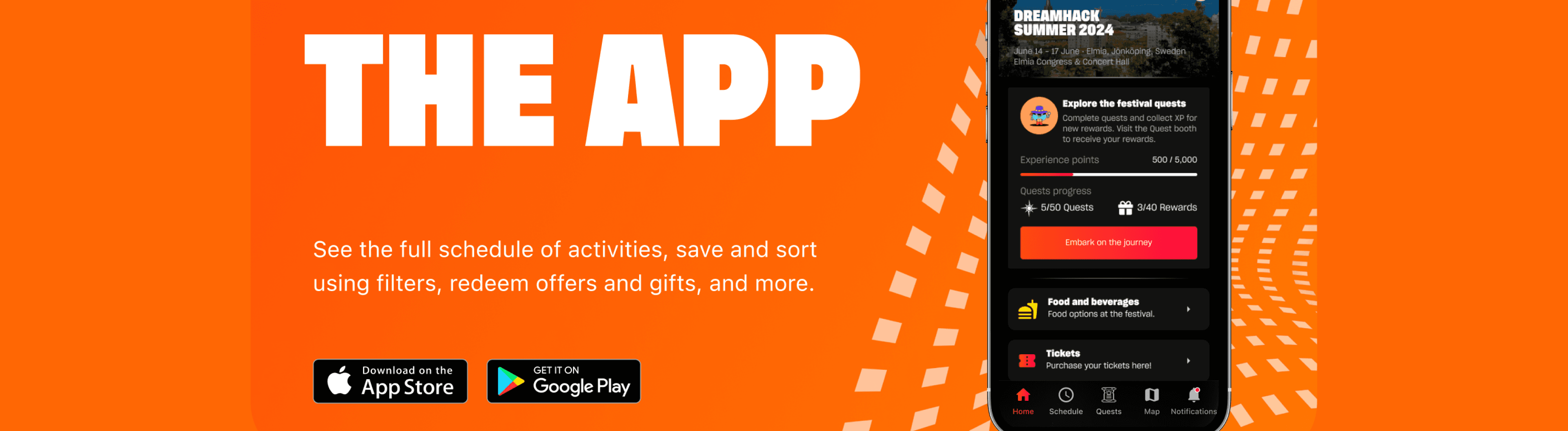

DreamHack (Esports & Gaming Festivals)
Physical & Digital experiences: Gaming Festival App
DreamHack is part of FaceIT, the #1 esports organisation in the world.
The mission? Enhance the app experience to boost user engagement, usability, and attract new sponsorships through innovative gamification.
Primary role:
Lead UX & UI Designer
Timeframe:
2023 - 2024
Summary:
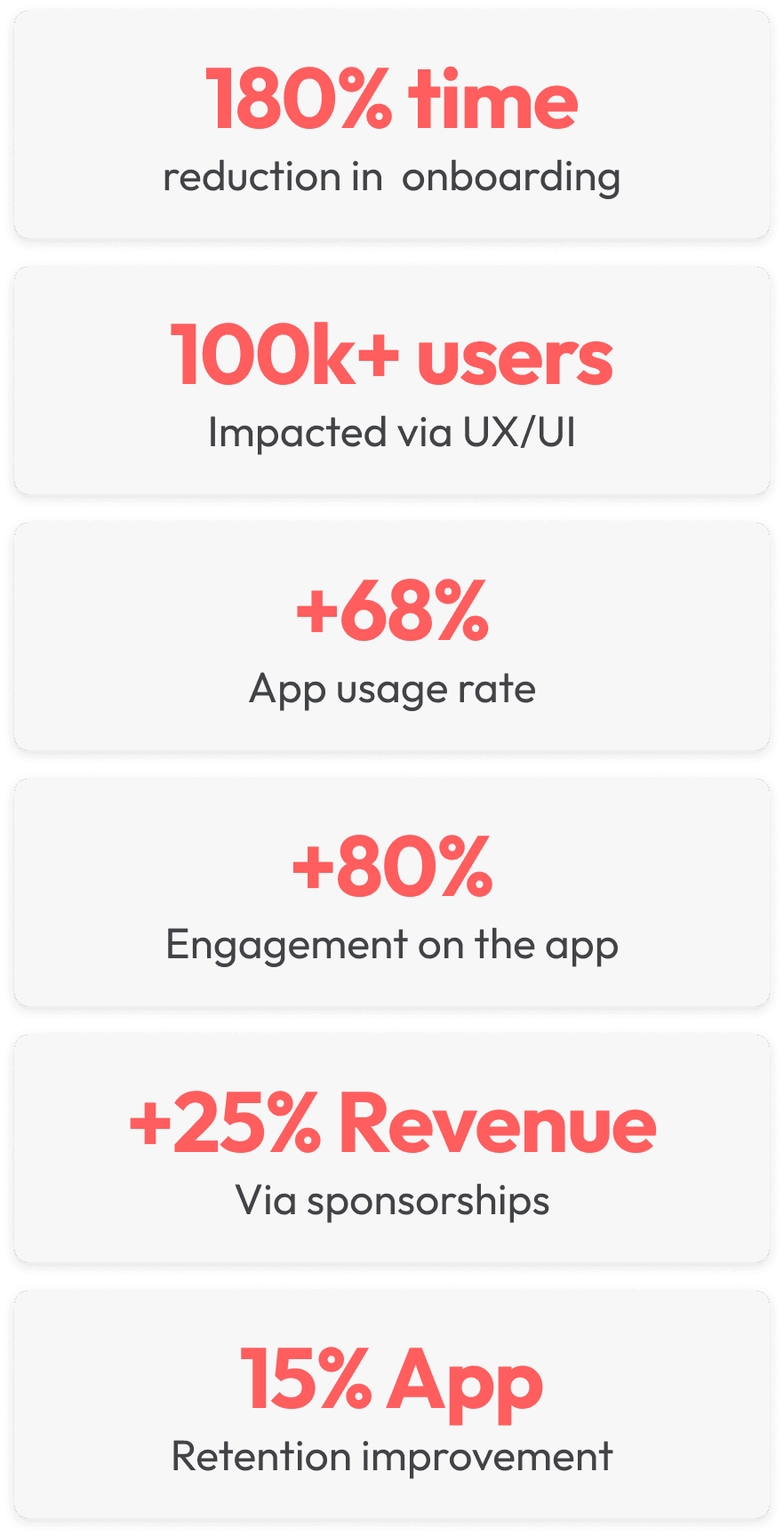
Joining a small team of 5, with an objective to create engagement with their 100k+ unique audience during gaming festivals, I led the designs to drive engagement up by 80%, attract new sponsors to generate revenue, and innovated on a quest system that produced a continuous loop of engagement, 25% revenue, and improved retention by 15%.
The App that wasn’t achieving its potential.
The DreamHack app had already gone through two design iterations by the time I joined the company. It’s first inception was from an internal team as part of an MVP release.
Wanting to get the most out of their app, DreamHack hired an agency to improve the app. Unfortunately, the improvements were mostly UI based, missing the crucial user experience work that make an idea into a great product for users.
DreamHack needed someone to come in who could take the wheel and guide the design process to increase the usability of the app whilst introducing new ways to create engagement for gamers and festival attendees.
My brief for the project.
The challenges, gaps and potential problem areas.
This was the first mobile app the company had made. There was no design language to follow, and the branding guidelines were lackluster as they did not take into account branding and guidelines for mobile applications.
The lack of a design library made things even more challenging, and could lead to a problematic scenario if UI elements were created to solve singular problems, potentially leading to an app with no visual identity.
The usability of the app, navigation, and almost every screen was also at a low standard. There was no hierarchy that would mean a smooth interaction experience for the users.
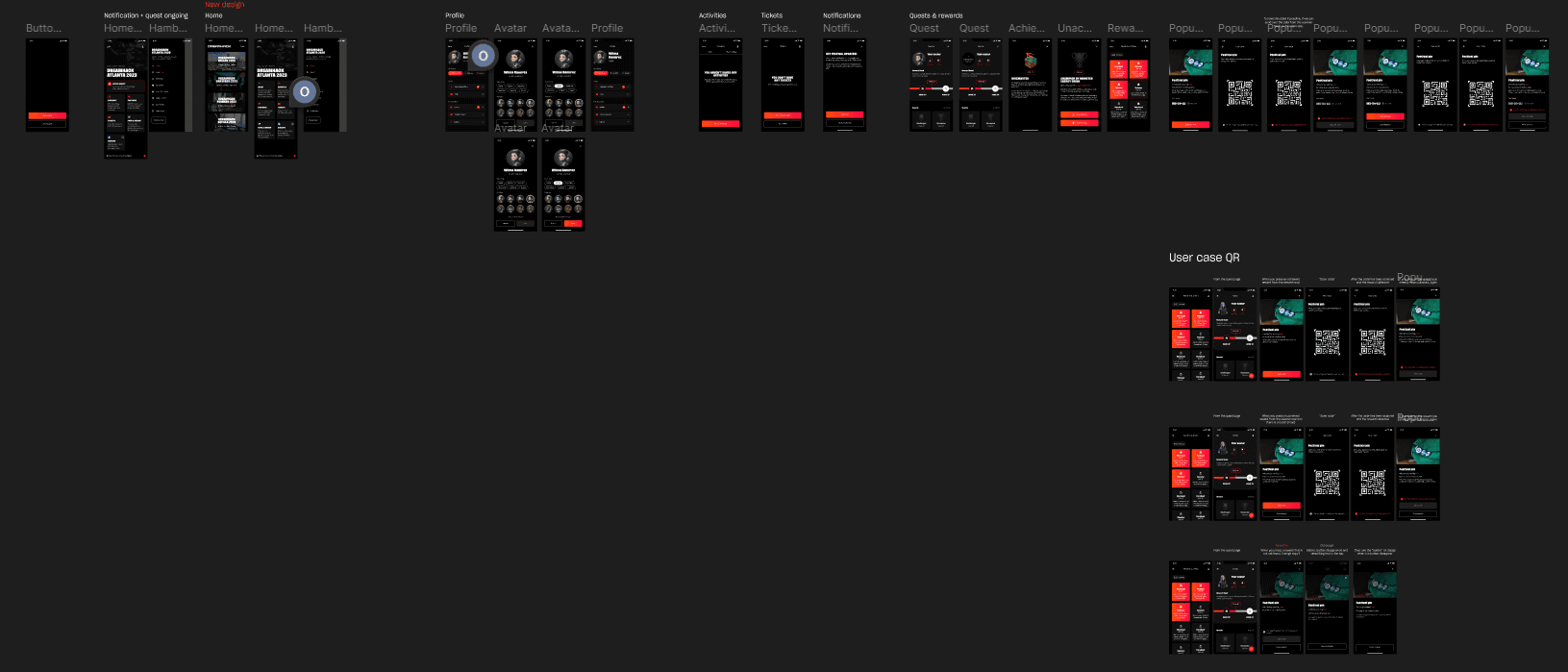
The entirety of the app UI designs before I joined the company
Identifying and prioritising areas of focus, and where to start.
While the team required specific features and new screens to be designed for festivals, with a roadmap and deadline of 2 months, it was imperative to create an action plan to ensure we set ourselves up for success.
🎓 User Experience expert reviews: Review the app’s UX and hierarchy by creating user flows and actually use the app, to gain knowledge on areas that miss that mark.
📃 Document findings to keep the team in the loop: When I started to make progress on identifying the problem areas, I created user flows and documented areas we could prioritise whilst working on other features.
🔎 Reviewing current user feedback: DreamHack used discord and had already documented some user feedback on the app’s usability. I reviewed the user feedback to back up my initial understanding and learn new information.
🙍🏻♂️ Business requirements vs user needs: Although the user feedback was important, it was key to understand what the business needs were, and align those needs with user needs to make sure my tasks were the right tasks to work on.
🎯 Align on the goals with the team: Once I had made enough progress, I shared my findings and priorities with the team, and we aligned on which areas were the most important to start with. This allowed me to finalise plans and start on improving the app!
Taking this approach allowed me to stay level headed, understand the overall goals of the business, and where to make a start. I could now start from my not-so-blank canvas and begin.
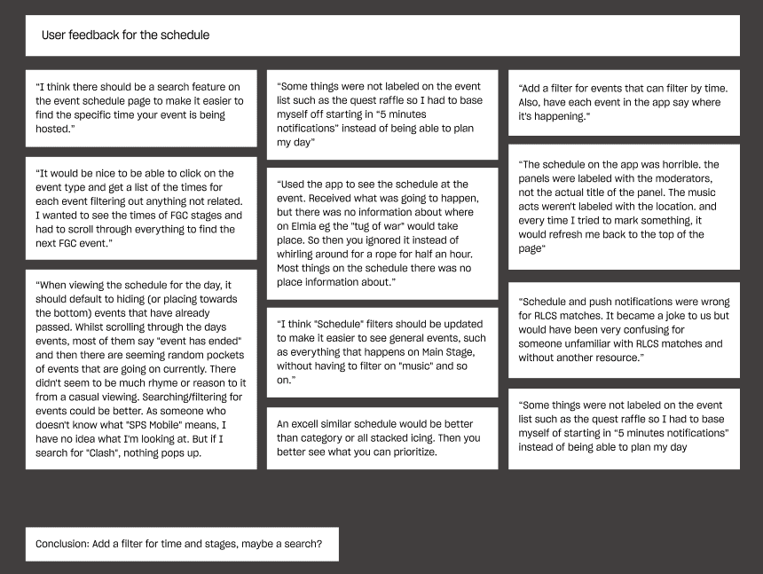
Example of some user feedback for the Schedule screens
Problems identified, and priorities made.
Here are the problems the team and I identified, whilst keeping the business needs in mind. Most of these problems were user-centric. We wanted to ensure we focused on improving the app first, before making new features.
Navigation: The navigation of the app was really hard to follow. No clear buttons or navigation system was put in place to guide users on where they needed to go to find the information they were looking for.
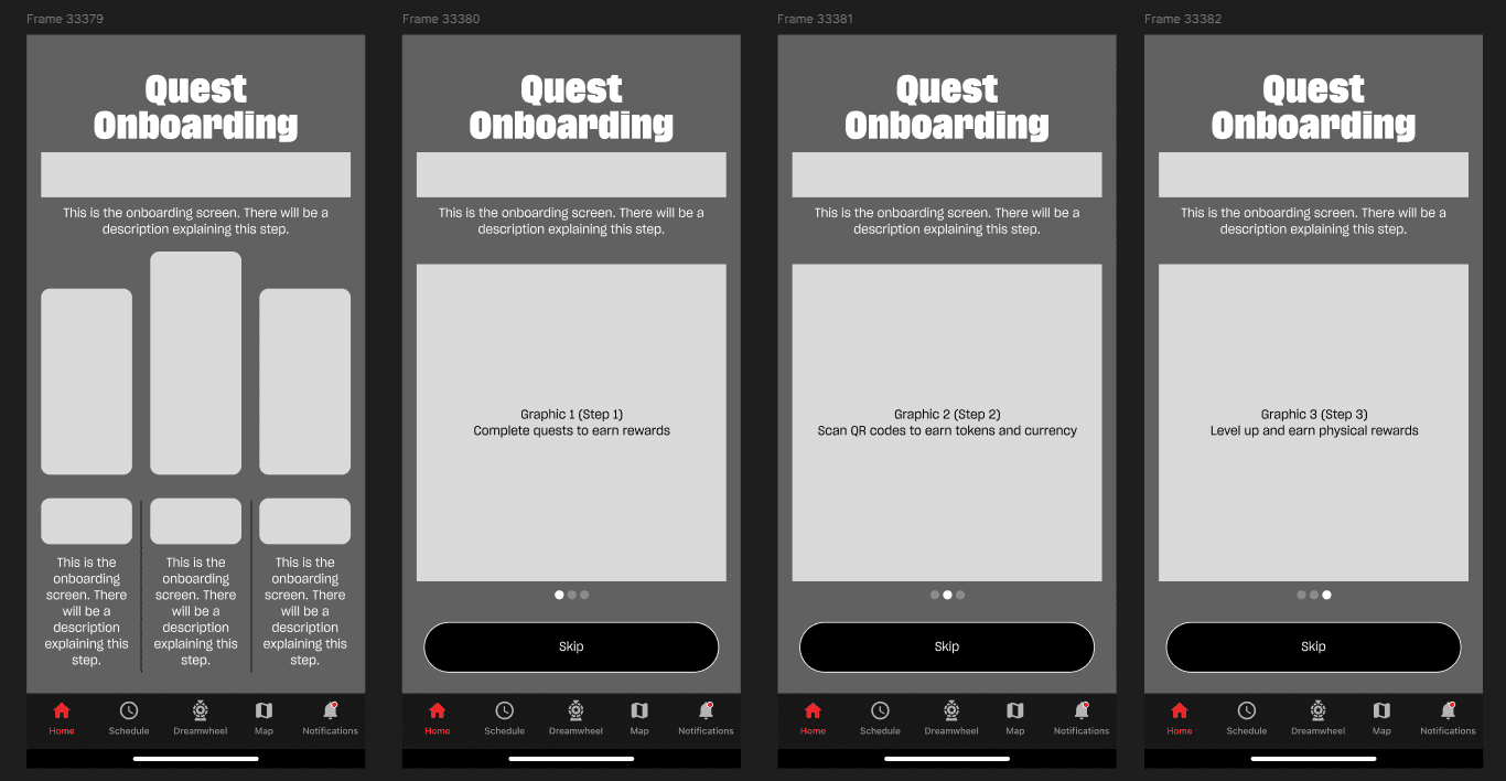
Onboarding: A Log in and Sign up processes were taking upwards of 2 minutes! Leading to users giving up on the process and visiting the website instead just to get the information they needed.
Schedule: The app had a screen that would show the events and activities happening during the festival, however, this was extremely hard to follow, and was missing crucial information (such as place and time).
Map: Map screens were essentially just a simple image that the user can look around on, and no real way to understand where the user was on the map, and where they would need to go.
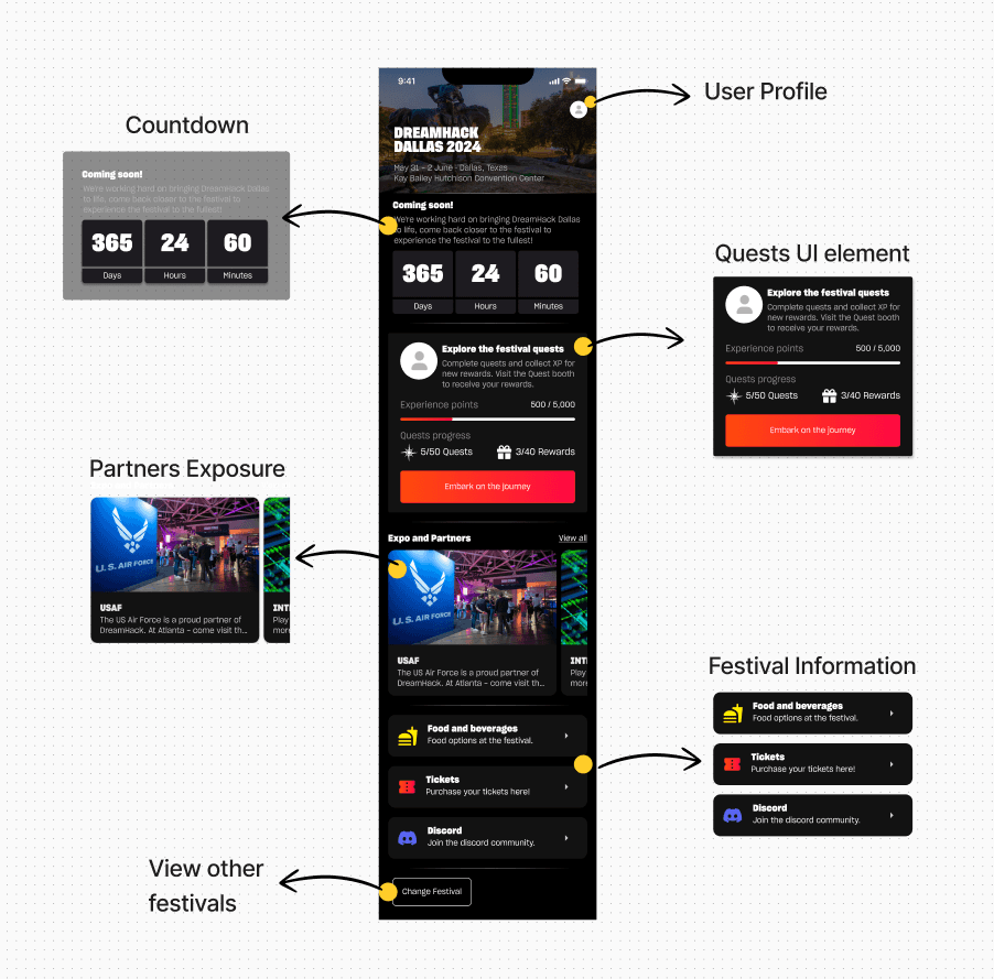
Homepage: The home page was not doing a good job of highlighting information users were looking for, but as a bonus, they were also lacking in creating exposure to company sponsorships, which was imperative to our revenue generation.
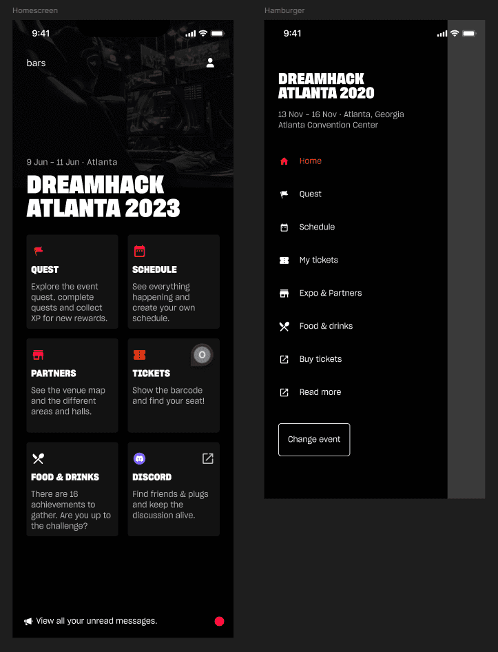
The old version of the home page
Clarifying some audience specific challenges.
Our audience age range would be anywhere between 16 to 40+ years old. With DreamHack being the biggest gaming festival, it also meant that parents and guardians would also be attending the events.
In some cases, parents and guardians of attendees would want to get event information before dropping off their children at the event. This was important to keep in mind when designing new flows.
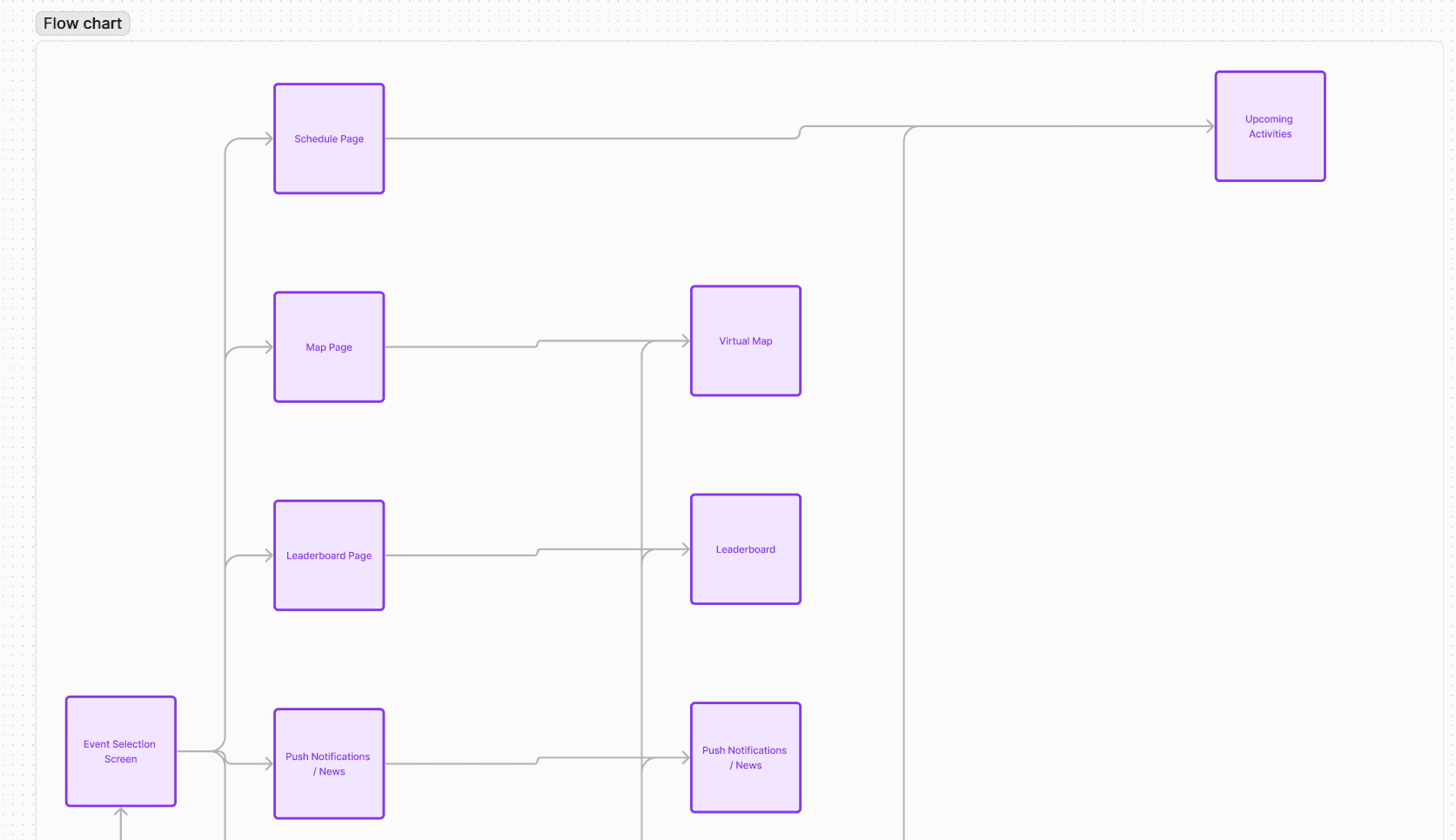
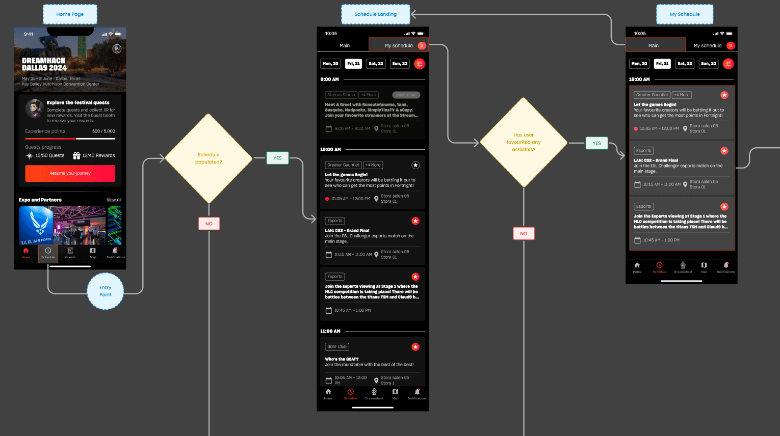
Mapping out the current navigation flow
The new navigation flow.
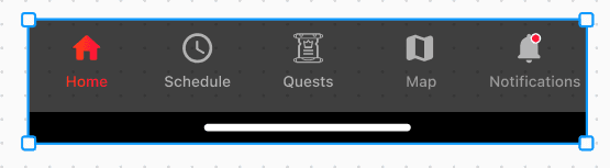
To make a start on the navigation, I began creating a flow chart to better understand where we need to be with the new navigation.
Exploring some ideas and benchmarking, It was clear that the best way to solve this problem would be to move away from the burger menu into a nav bar.
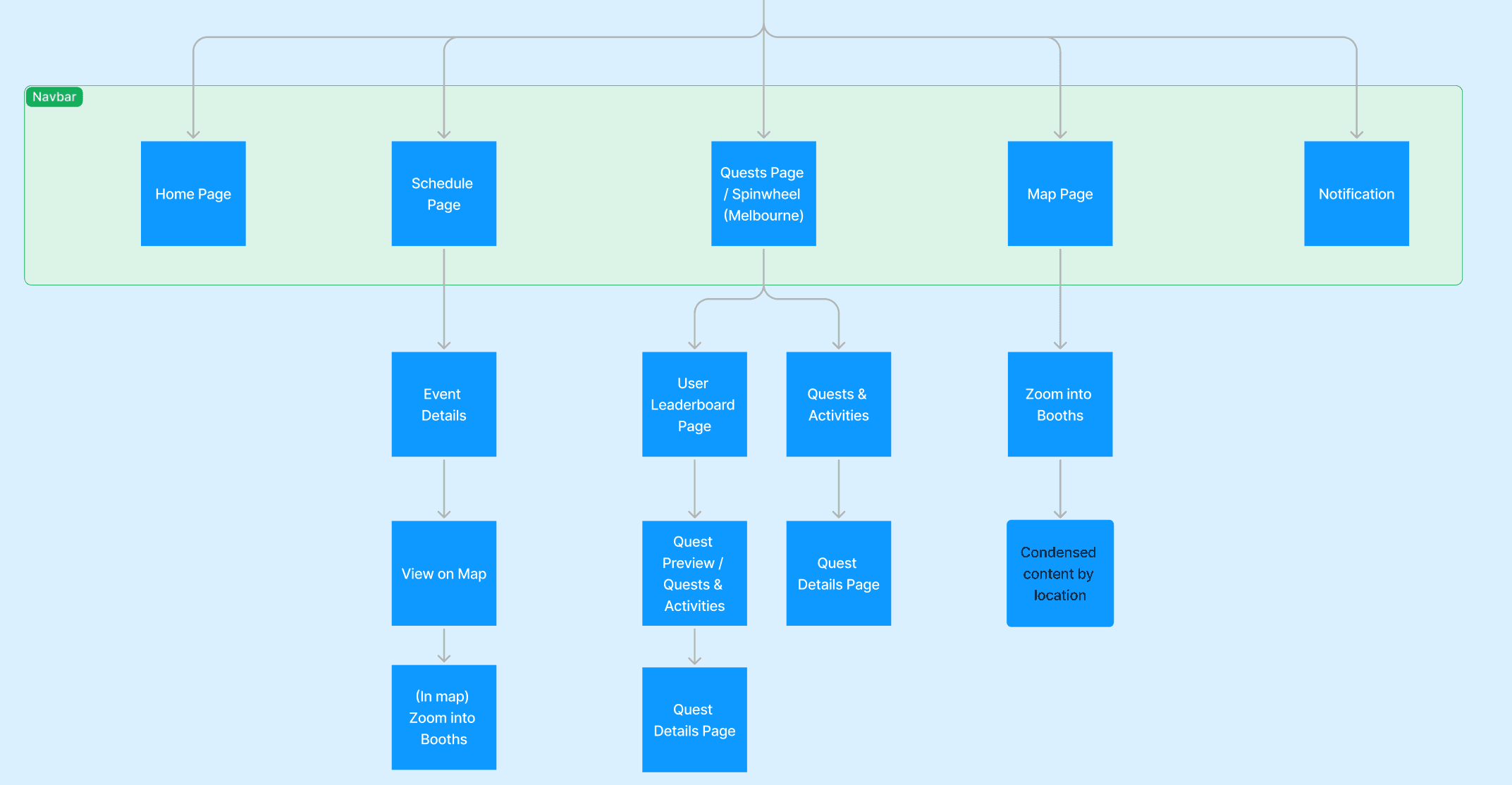
The new navigation flow plan
Where to put the burger menu items.
The idea to move away from the burger menu to a navigation system was an easy decision to make, but it came with its own challenges. The burger menu had a total of 9 buttons.
We had to make a decision on where these buttons would live, which buttons would go on the nav bar, and which would be placed onto the home page instead.
Keeping our initial goals in mind (Ensuring important information is easy to access and increasing engagement), it became clear that we wanted Schedule, Map, Notifications and Home Page on the nav bar.
Note: Any item that wasn’t included in the Nav Bar would live on the home page, making it just as important as it would now include festival specific information vs entry point buttons.
Moving the burger menu items on the home screen
Festival specific requirements and complications.
Each festival had its own fun identity and activities at DreamHack. This would be tied to activities, prizes, booths, whatever that may be, which meant the app would need to create avenues for users to engage with those systems.
This became more complex when those activities could only be interacted with in person. For instance, a spin wheel booth that attendees could go to, after scanning QR codes at the festival, to spin the wheel and earn physical prizes.
To solve this challenge, we decided to add the final button to the navigation. This button would change between two states based on the festival. For example, Melbourne Festival would have a DreamWheel button on the nav bar, taking users to the spin wheel page, whilst other festivals would have the Quest page. More on that later!
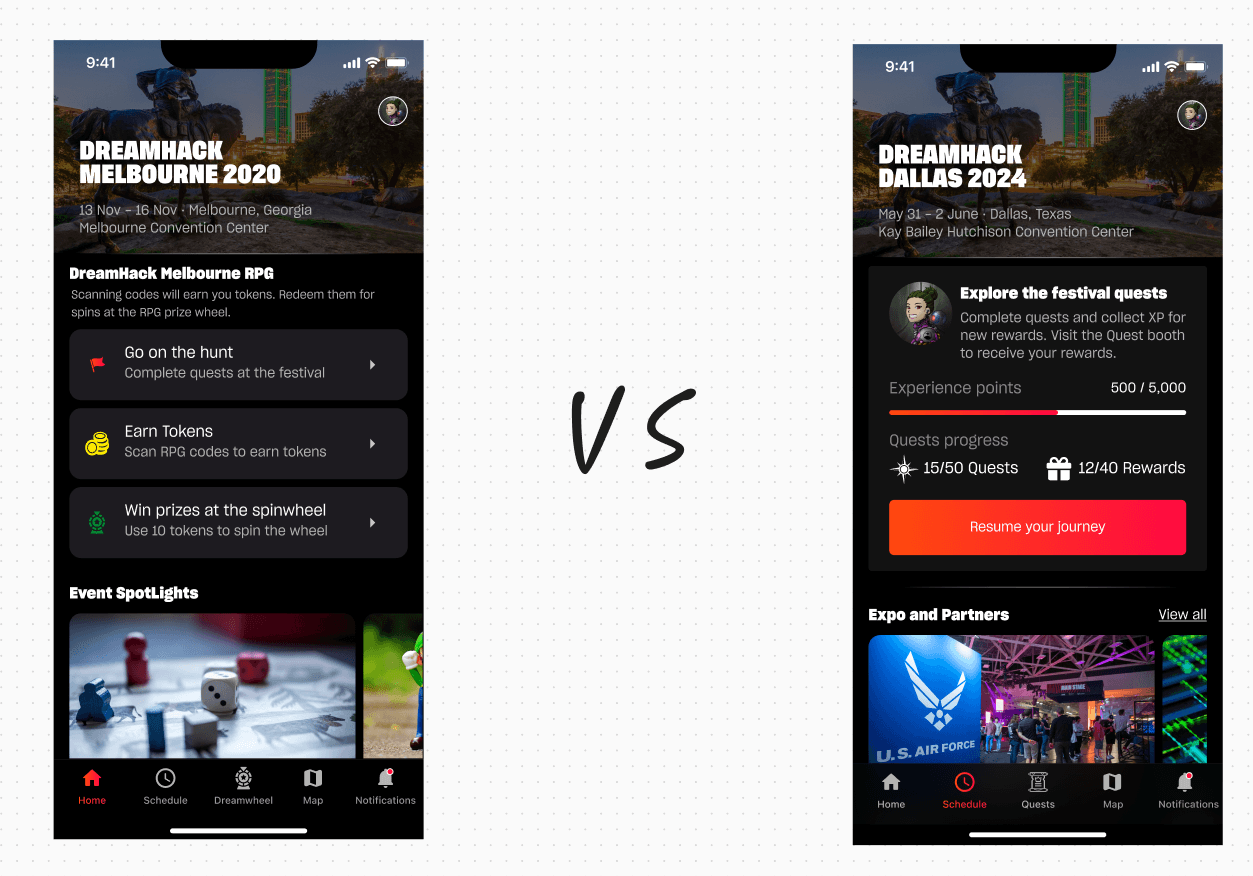
Melbourne Festival Home Page (Left), Dallas Festival Home Page (Right)
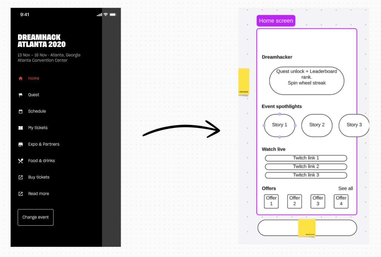
Designing the new Home Page.
With the initial picture painted, I began designing the new home page. As spoiled for you above, there needed to be two states of the home page based on festival needs.
What does it achieve:
Clear information Hierarchy
Allows us to create more engagement with sponsors, leading to more revenue.
Gives more weight to festival information
With the addition of our Nav Bar, users can now find what they are looking for faster and easier.
Home page and Nav Bar
Button placement rules and clean up.
With the redesigns, I also worked on rules and documentation on button placements. With the removal of the burger menu, back buttons and page overlay close buttons needed to have a set rule that would apply to them.
I collaborated with the developers to ensure we had a source of truth to follow, and updated the locations of all call to actions, button placements, on all pages.
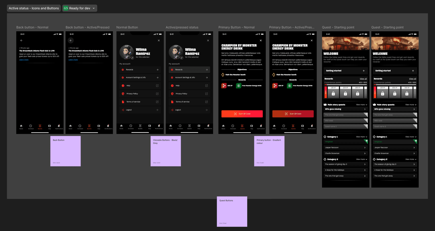
Icons and buttons - Active states, positioning
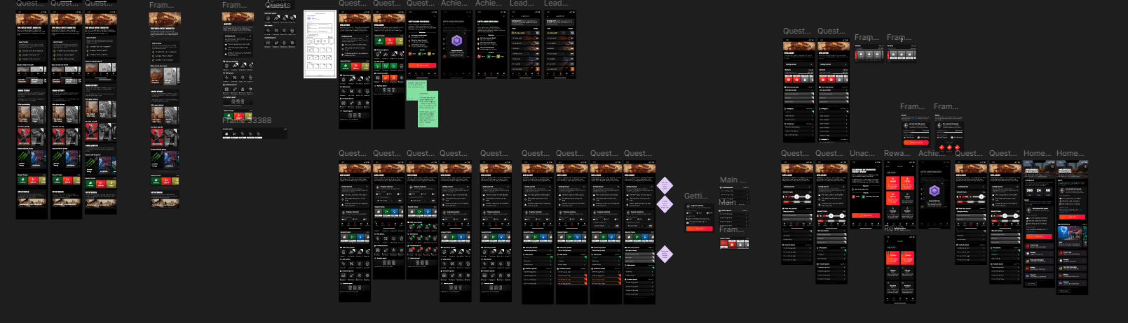
Rinse and repeat. More than 50 screens went through a UX audit and redesign!
With the new navigation system in place, it was time to start the UX audit and updating all screen pages. This was time consuming but relatively simple to follow.
I would always start with creating flows and wireframes, and then begin high-fidelity designs. Once that was done, I would get internal feedback, prototype, and make any further changes based on user feedback and internal feedback.
Here is the schedule page flow and UX audit.
Optimising the on-boarding process using Google and Apple logins.
On-boarding onto the app was extremely time consuming due to old systems still in place, and no real updates to keep the app quality in line with industry standards.
Goals:
Reduce sign up and log in times
Allow users to use the app without being forced to sign up
Features that required local user data would prompt users to log in
Allow in-app log in and sign up flows.
The simplest way to solve this problem was to introduce expected features such as the Google and Apple sign ins. I redesigned the entire user on-boarding journey, and optimised log in and sign ups from 2 minutes to 10 seconds!
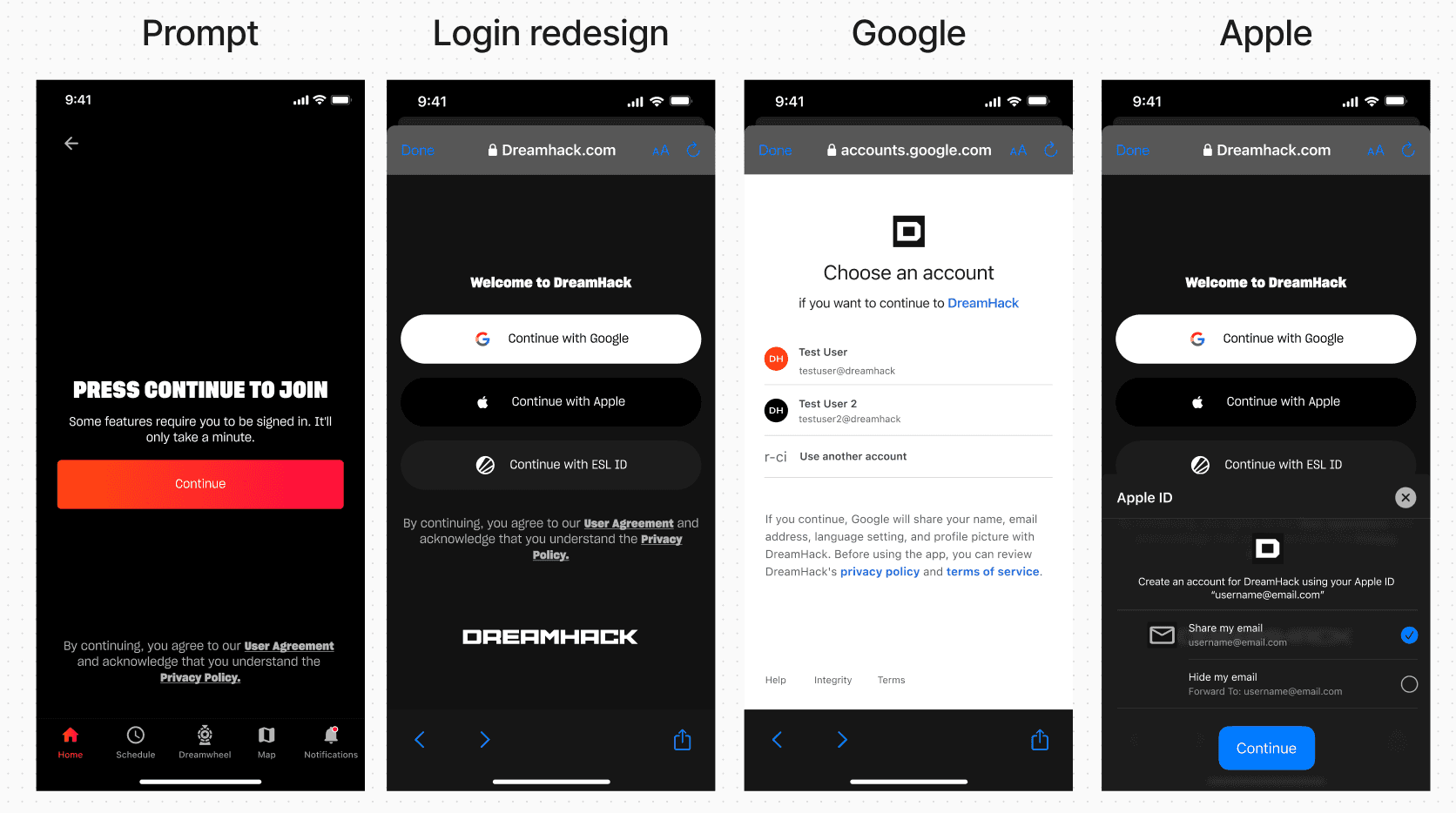
Simple view of the log in prompt -> Google and Apple Login
Despite efforts, engagement was still quite low.
How do we increase engagement to generate more revenue?
Why was the engagement of the app low.
First problem with the app was the usability. Redesigns and optimising the app was the first hurdle, and that went great! Review ratings increased, user feedback was great, but despite that, users were still barely using the app during the festival.
One of the main sources of engagement for the app was the quest system. Quests were essentially QR codes scattered around the festival venue. Users would need to scan the QR code, and earn rewards.
Despite a lot of effort and money being put into these, it led to massive problems that encouraged users not to engage with the system.
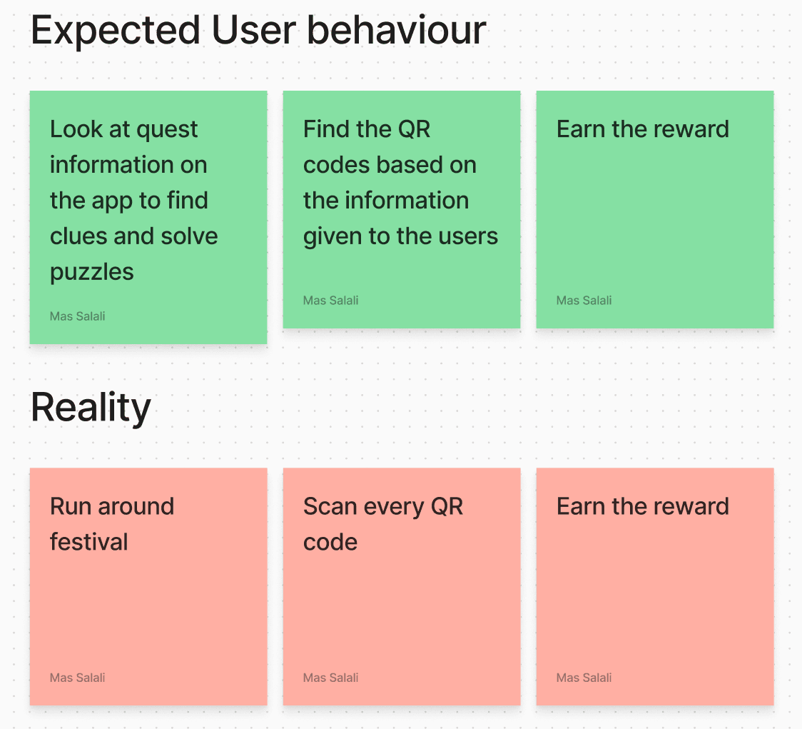
Expected user behaviour -> vs what was actually happening
Why was this a problem, and how can we solve it.
Quests would generally lead to booths and activities set up by sponsors. This would be one of the main sources for the company to advertise for its partners, and in return, generate more revenue. (More exposure -> more revenue).
Other problems:
100s of assets were created for the quest system, such as badges and icons
Budget was being spent on a system that wasn’t seeing enough return
Sponsors were not seeing enough engagement to justify the deal
Users didn’t think the system was fun
How did the old system let these problems arise:
The app wasn’t doing enough to ensure the system was engaging
The map was showing the locations of all QR codes
Quest information was so unclear, no one wanted to read it
Incentives for quests were just not clear or enticing enough
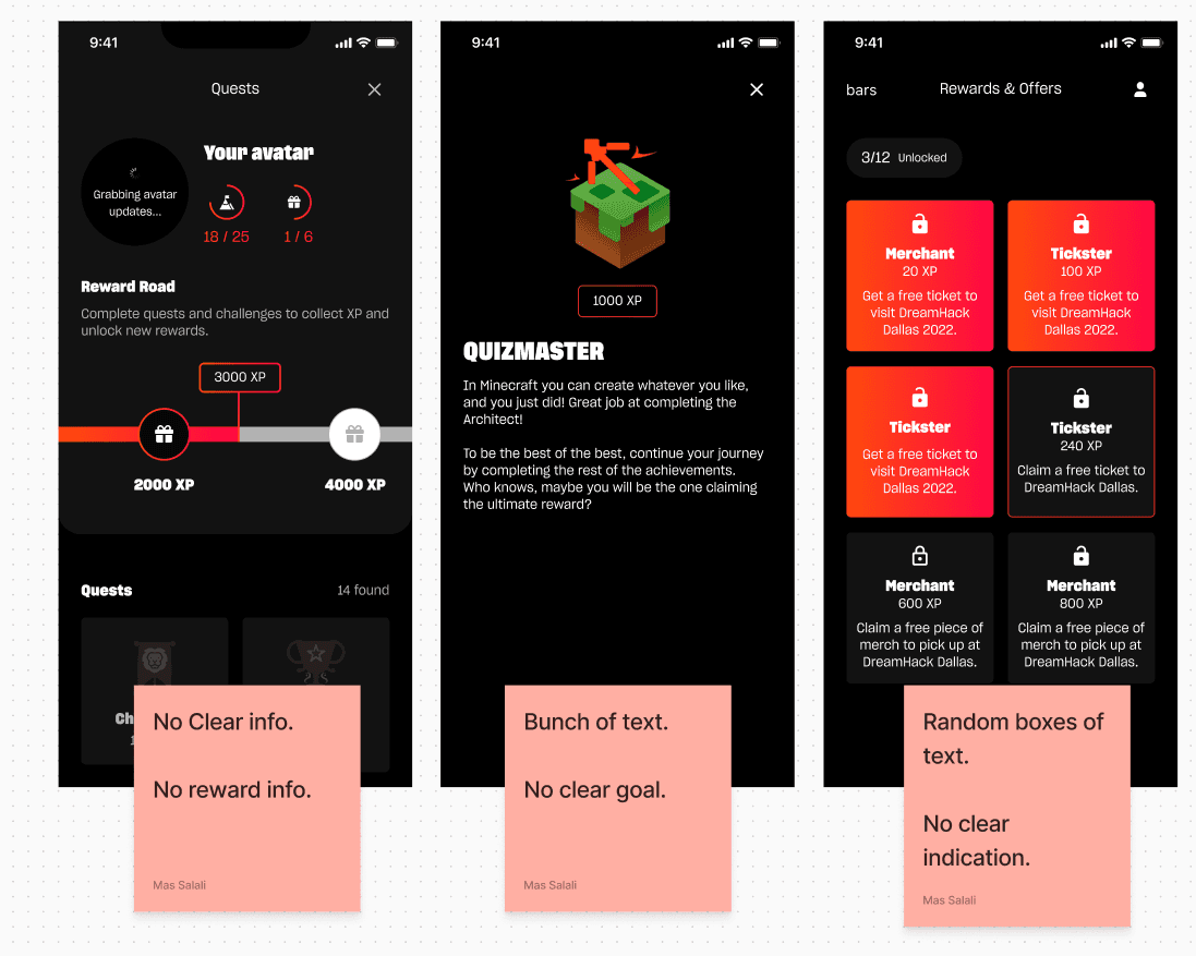
Quest system and information hierarchy
Collaboration with the team and understanding requirements.
Before jumping onto solving these problems, it was imperative for me to understand how DreamHack works internally when setting up the quest QR codes at the venues.
I worked with internal teams and facilitated a workshop, to better understand how we do things now, vs what we need to do to achieve our overall goal.
Prep work:
Create a moodboard and draw from examples of other apps solving similar problems
Design quick ideas to put on the board to start the initial conversations
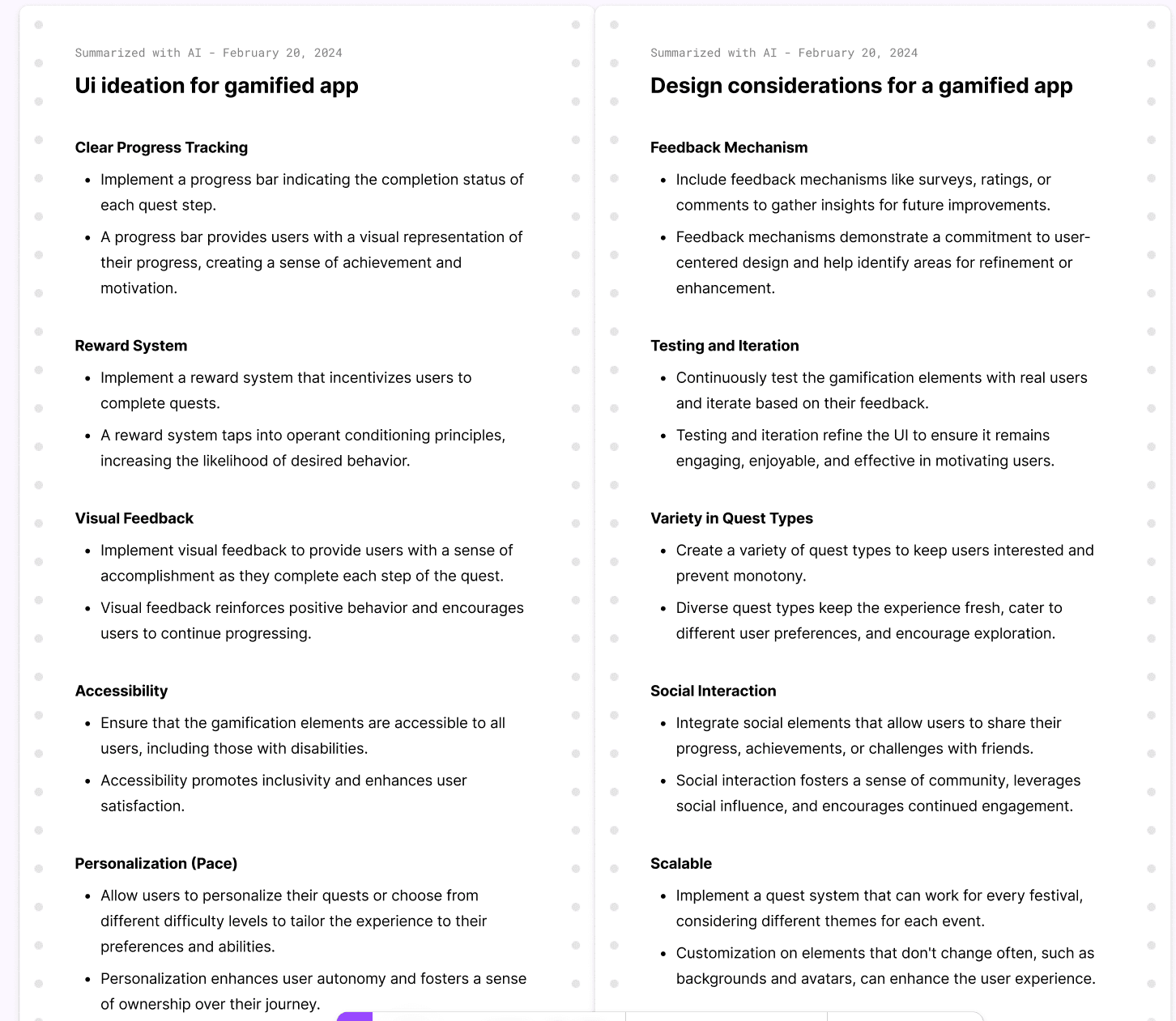
Research on what to think about when creating gamification systems and flows for mobile apps
Don’t forget the Ice-breaker!
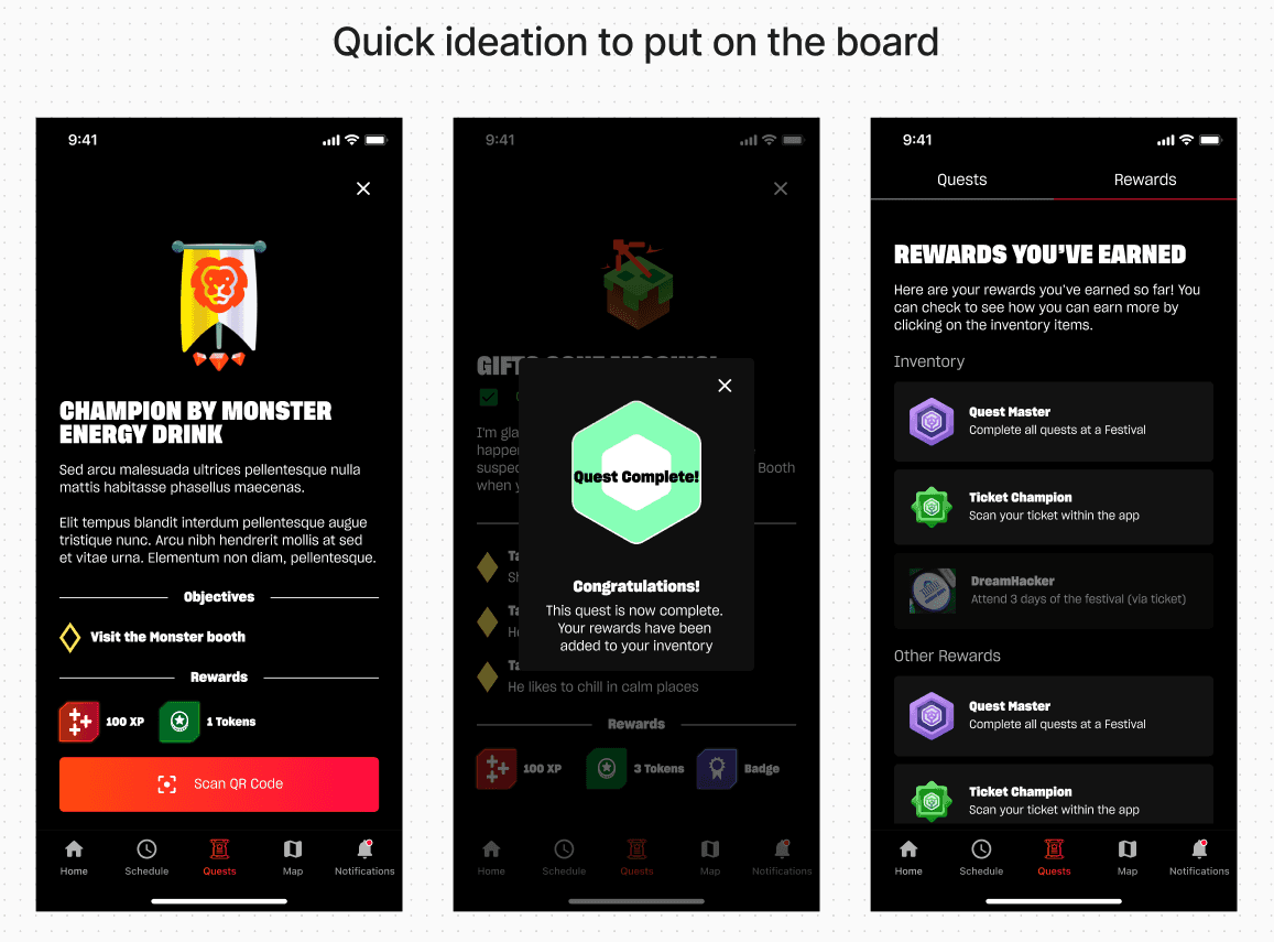
Ideating on where we could start.
What came after the workshop.
Here is what we aligned on after a 3 hour workshop with stakeholders and internal team leaders.
Take advantage of our festival themes
Clear way to display information
Allow users to engage with the system even after completing all quests
Introduce a way to battle users not engaging with the system
Rewards need to be more clear
The quests need to help us create exposure to sponsors and partners
A glimpse of workshop outcomes.
Exciting the users by creating a user friendly gamification system.
One of the goals I had when thinking about the quest system, is how users would think of it even before using it. In the gaming industry, there’s a lot of fear of missing out, meaning systems would be designed to encourage users to interact with the system as soon as possible, tied with limited timed rewards to ensure users would feel forced to complete objectives as soon as possible.
This was a problem for DreamHack. Firstly, it was bad user experience, and secondly, DreamHack sold festival tickets on a per-day system, expanding to 3 days per festival.
Meaning if an attendee purchased a ticket for only 1 day, it was important that they would be able to earn all rewards, without feeling the need to purchase a 3 day ticket. (ie. no timed based quests, or limited quests)
Ideations and Iterations.
Now we’re getting somewhere.
What do the redesigns achieve.
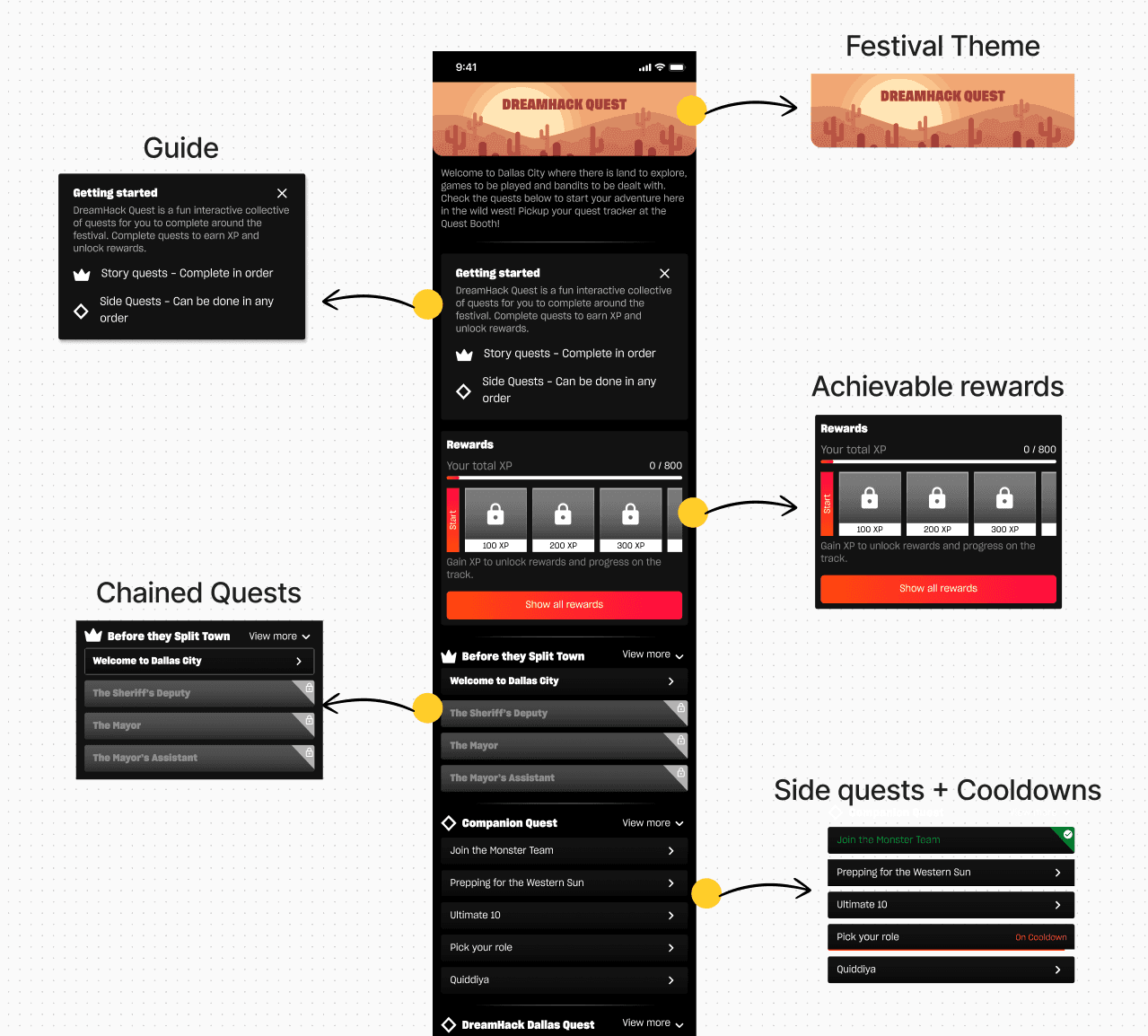
Looking at our initial plan, our goals for the system, and areas we identified for improvements, here are the solutions and how they solved our problems:
Festival Banner: Allows us to leverage festival themes. These images would be the same banners commissioned for the festival itself, creating a link between digital and in-person experiences.
Guide card: Helps us onboard users with this new system, with simplicity as our top priority.
Reward Track: Allows users to earn all achievable rewards within a realistic time frame, no matter if they have a 3 day ticket or a 1 day ticket.
Chained Quests: Designed with a clear starting and finishing point, to help us guide users to sponsors whilst telling a cool story, completely festival themed.
Side Quests and Festival Quests: Helps us create engagement for festival / location specific activities and sponsors.
Quest Page redesign.
Leveraging the reward system to shine a light on partners.
We could still do more to increase our revenue and engage our audience with our partners. The initial things were already in place, partners already had a booth set up, so what can we do?
Design specific quests and rewards, dedicated to partners
Let the users create a loop to invite others to take part
By creating rewards around partners, we essentially created a loop of engagement. On top of the new quest system showing so much more engagement with our audience, we hit the mark for where we wanted to be!
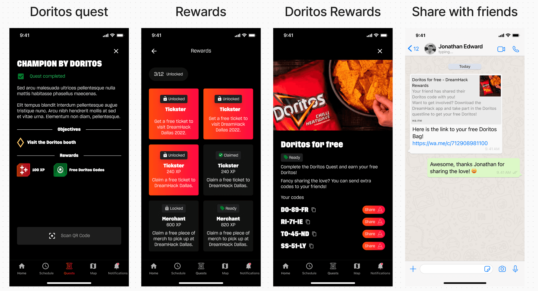
Partners specific quests and rewards. Includes sharing codes
Let the results speak for themselves!
Here is the impact I was able to have on this project. I’m very proud of what I achieved with the team, and how I collaborated with our stakeholders to pave a clear road to success.